When developing your sign, or creating your sign layout there are several things that you should keep in mind to ensure that you have a sign that will last years and will advertise your business in the best possible way.
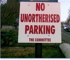
1. Spelling – ensure that the spelling on the proof and the details that you give to your sign writer are correct before you authorise the job. If you are having lists of names for an honour board or a directory board, ensure that you have someone else double check that the spelling of people’s names is correct.

2. Does your logo adequately represent what you do. Your sign and logo should give passers by some indication of the field that you are in, especially if your signs are for advertising and attracting passing traffic.

3. Ensure that the wording on your sign makes sense. Is it grammatically correct? It is also important to make sure that others can’t interpret your sign in other ways.

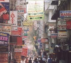
4. Don’t try to cram too much on one sign. It will be visually overloading to people and will detract from your business.

These are some simple quick tips to follow. If you follow this simple advice then you will have a sign that will make sure that your advertising is advantageous to your business.
Read some of our other related blog posts:
Developing your sign layout part 1
Developing your sign layout part 2


I like your fourth tip to not overcrowd your sign with information or colors. If you look at some of the most successful businesses today, most of them have very simple, yet recognizable logos. Finding something like that to put on your sign would be ideal.