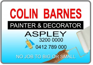
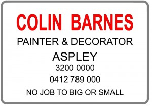
Our last post was the beginning of our series on developing a great sign layout. This post develops this concept further on designing your sign and sign layout.
Developing the sign layout
The main attributes of a good sign are:
- Colour scheme;
- A sign panel that is not over crowded with wording – less is more!;
- The right size font – if you have your lettering too big then the sign looks like it is writing of the panel and you have no background to read;
- Colour scheme – certain colours should never be used together – red and green, blue and green, and red and blue;
- Anything on the colour wheel that is directly opposite usually works fine;
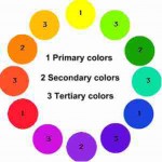
- The way to know where colours are going to work or not are to look at the tonal value. Therefore for colours like red and blue – a black and white photo containing both these colours would be similar greys and this is why they don’t work together. But if you have dark colours and light colours they will usually work well;
- Don’t use too many colours, as you will finish up with a sign that looks like a rainbow!
If you keep all these factors in mind you will come up with a good colour scheme, such as a white background, with red lettering black outline and subtext in black with a grey border around the outside of the panel. Another good colour scheme is a yellow background with black lettering. That is the reason why traffic/caution signs have this colours scheme. This will give you some idea of what will stand out. Now that you have organised your text and your colour scheme, you need to decide what type of fonts you would like to use.
Fonts to use:
- Usually a medium weight face (not really light or extra bold) these fonts are normally the easiest to read.
- E.g. Helvetica Bold or Arial Black,
Then it is time to put all these things together. You can also then experiment with different colours and different fonts.
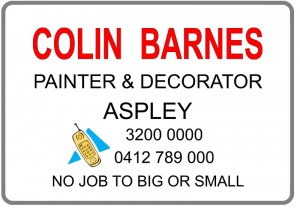
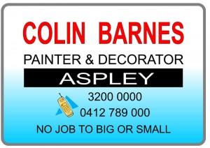
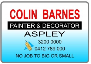
At Sign Age we are happy to accept your layout in a pdf or eps format. We are also prepared to work with you to improve and refine your layout, and give you options, as a good sign will be the best investment that your business has ever made.
It is important to remember that a sign is not like an ad in the paper, only need to pay for it once, and they will last for many years, it is therefore imperative that you have sign that not only you are happy with, but that has a layout and design that will increase your business.
